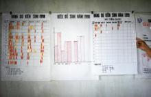
Global health professionals are tasked with communicating data to decision makers in efficient ways. The volume of data available throughout the world is ever-increasing: Open data initiatives, global data banks from institutions including the World Bank and WHO, improvements in routine health information systems, and data generated by health projects all fuel results-focused programs and make information increasingly accessible through various web portals and data-sharing requirements.
Translating tables of data into something meaningful to consumers can pose a challenge. Even the most sophisticated consumer of data can benefit from clear visualizations to promote the use of data for decision making. As with all health communications, data visualization relies on identifying your audience, developing a clear message, and appropriately planning for how the visualization will be shared and used to inform program and policy decision-making.
In this course, participants will learn to identify their audience; find a story in a set of data appropriate for a target audience; understand the process of developing simple but compelling data visualizations; share and disseminate the visualization; and promote ongoing use of the data to inform decision-making. Learners will have the opportunity to work through a guided example to develop a visualization for a specific audience, with an emphasis on the process of developing strong data visualizations and using that process to promote the use of data for decision-making (rather than simply for reporting).
Objective
When you have finished this course, you will be able to do the following:
- Explain the value of data visualization to global health activities
- Understand how to identify a key story in a set of data
- Learn how to customize data visualizations for different audiences
- Explore different strategies for focusing attention on the key data in visualizations using attributes such as color, intensity, size, and orientation
- Learn how to assemble a team of data visualization experts to prepare more advanced visualizations, such as infographics and interactive web or mobile tools
- Learn about current data visualization resources, software, and good examples of data viz in the health and development communities
This course does NOT cover the following activities:
- Detailed training on building graphs and charts
- Training on visualization software programs
- Training on GIS mapping activities or approaches
- Training on basic math and statistics, though some resources will be referenced
- Training on data quality protocols
Credits
The course authors would like to thank Jim Shelton and Madeleine Short Fabic for their review of the course and many thoughtful edits. Thanks also to our colleagues who have reviewed the course and provided ongoing support, including Clara Burgert, Laurie Liskin, and Sally Zweimueller at The DHS Program; Jeniece Alvey, Jack Hazerjian, Ilene Speizer, and Beverly Tucker on the Measurement, Learning & Evaluation Project at the University of North Carolina Chapel Hill; Naheed Ahmed, Simone Parrish, and Tara Sullivan at the Johns Hopkins Center for Communication Programs; and Jessica Dubow and other JSI staff from the USAID | DELIVER PROJECT. Thanks also to the generous experts in the data visualization community, especially Jake Burkett, Ann Emery, Stephanie Evergreen, Jonsen Carmack, Johanna Morariu, Cole Nussbaumer, and Jon Schwabish.
Time
- 2 hours
Published/Updated
- Friday, August 28, 2015
Course Authors:
Erica Nybro, The DHS Program
Libby Skolnik, CCP
Amanda Makulec, John Snow Inc.
Course Managers:
- Nandini Jayarajan, CCP
